


Thursday, July 3, 2014
World Cup Fever
Futures End seems to be selling very well for DC. If 40% of their audience is buying it, the company must be very happy, indeed. How long untill all their titles are weekly?
Last week's poll question: Do you plan on buying the rest of FUTURES END? (55 votes)

The World Cup quarterfinals start tomorrow. While the international version of football — what we American call "soccer" — isn't my preferred type of football, I can appreciate that it might be someone else's. Which brings us to today's poll:
Comments (2) | Add a Comment | Tags: futures end polls soccer sports
Wednesday, July 2, 2014
The Fate of All Reality
Smallville: Chaos #4 came out last week. Our hero appeared on only one panel, but what a panel!
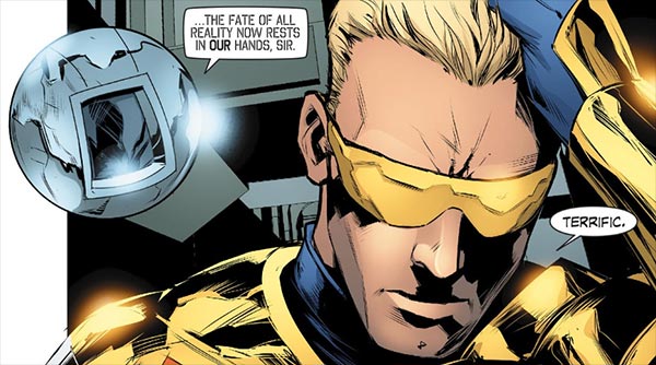
Smallville: Chaos #4. Writer: Bryan Q. Miller, Art: Agustin Padilla, Colors: Carrie Strachan
No pressure.
This issue is available online at Comixology.com now for 99¢. The printed edition collecting the first 3 digital installments as Smallville Season 11: Chaos #2 should be coming to your Local Comic Shop in September. If this chapter is any indication, expect plenty more Booster Gold to come!
Comments (0) | Add a Comment | Tags: comixology.com smallville
Tuesday, July 1, 2014
Would-be World Conquerors Need Love Too
TitanTrap Customs continues to give us the action figures we'll never see from DC. This month, it's Booster Gold's first arch-villain: The Director of Death!

If you're unfamiliar with the first 13 issues of Booster Gold's original series, know that a scheme of the Director of the 1000 that was the first crime Booster Gold foiled. As a result, the Director became Booster's first arch-foe.
Before you say, "why would anyone want that loser," know that the Director sold last week for $36 on eBay.com. For old-school Booster fans, he's worth every penny!
You can see more customs on TitanTrap's Facebook page.
Comments (4) | Add a Comment | Tags: action figures director of death fan art titantrap customs
Monday, June 30, 2014
Going Out in Style
Let's get this week started the right way: with cosplay!
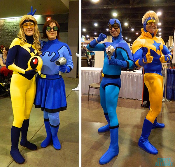
Blue and Gold forever! ComicsAlliance.com found not one but two sets of Blue and Gold cosplayers last week at Charlotte's Heroes Con 2014. You can find larger image in their gallery here.
And while we're on the subject, I hope you didn't miss this unique cosplay that Osyrus posted in the Boosterrific Forum last week. It's a great costume that deserves some recognition.
Great job everybody.
Comments (0) | Add a Comment | Tags: 2014 blue beetle charlotte comicsalliance.com conventions costumes heroes con jay tallsquall osyrus rusty winns
Friday, June 27, 2014
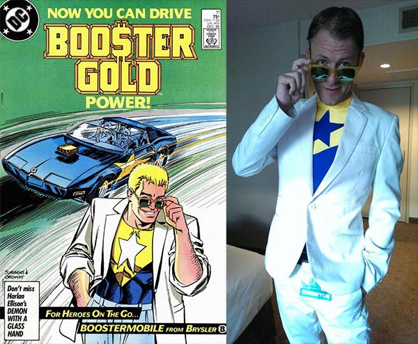
Happy Birthday, Dan Jurgens!
He brought you Agent Liberty, Risk, Waverider, Doomsday, and Cyborg Superman. But most importantly, he's the creator of Skeets and someone called Booster Gold. Who else could it be but Dan Jurgens?
Jurgens celebrates his 55th birthday today, and he'll no doubt be celebrating by slaving away at the drawing board for future issues of Futures End or maybe pages of September's Booster Gold one-shot. But you can celebrate by bidding on some of Jurgens' old work, specifically this poster from his run on Justice League:
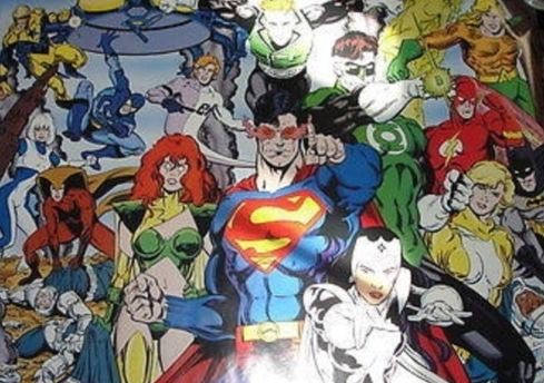
That rare poster from 1992, drawn by Dan Jurgens and inked by Rick Burnett, is currently listed for sale on eBay.com. The auction ends Tuesday, so act fast. You don't want to have to wait another few decades before you get another shot at it.
Thanks for all the hard work over the years, Dan! Here's to 55 more.
Comments (0) | Add a Comment | Tags: birthday dan jurgens ebay.com poster rick burchett rudy jaquez
SITE SEARCH

SPOILER WARNING: The content at Boosterrific.com may contain story spoilers for DC Comics publications.
Booster Gold, Skeets, and all related titles, characters, images, slogans, logos are trademark ™ and copyright © DC Comics unless otherwise noted and are used without expressed permission. This site is a reference to published information and is intended as a tribute to the artists and storytellers employed by DC Comics, both past and present. (We love you, DC.) Contents of this page and all text herein not reserved as intellectual property of DC Comics is copyright © 2007-2026 BOOSTERRIFIC.com. This page, analysis, commentary, and accompanying statistical data is designed for the private use of individuals and may not be duplicated or reproduced for profit without consent.