


Showing posts 16 - 20 of 33 matching: norm rapmund
Monday, March 21, 2016
It Figures That Booster Would Be a Gold Card
It's been a long time since I played a game of Magic the Gathering, but I might consider jumping back in if Wizards of the Coast was adding more Gold to their boosters.
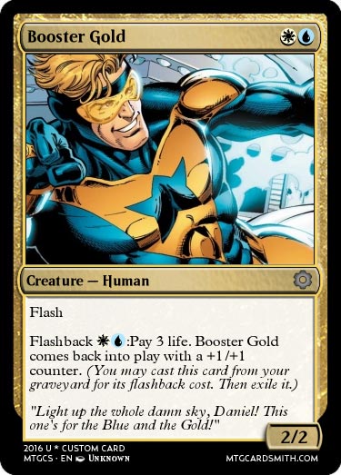
This card was put together by TheUndead_King at the custom card website MTG Cardsmith. It's easily my favorite card since Black Cat! (For the record, my favorite card ever was Stasis. Yes, I enjoyed ruining your day.)
Although TheUndead_King left the artist on his card as "unknown," let me assure you that it is Dan Jurgens and Norm Rapmund artwork from Booster Gold Volume 2, #1. (And while I'm at it, the flavor text is from 52 Week 52. Damn, we got some good Booster Gold comics there for a while.)
Comments (0) | Add a Comment | Tags: dan jurgens games magic the gathering mtgcardsmith.com norm rapmund theundead_king
Tuesday, October 6, 2015
The Blot's Sketchbook Strikes Back
The Blot had a busy summer. He picked up these fine sketch commissions for his Booster Gold sketchbook at Space City Comic Con:


From left to right, that's the work of Norm Rapmund, Scot Kolins, and Sean Galloway as the 21st, 22nd, and 23rd drawings in The Blot's Booster Gold sketchbook. You can see them and the other 20 pieces in much larger detail at The Blot Says' Flickr page. Thanks, Blot!
Comments (0) | Add a Comment | Tags: blot commissions fan art flickr.com norm rapmund scott kolins sean cheeks galloway
Wednesday, September 30, 2015
This Day in History: Booster Briefs
If you visit your Local Comic Shop today, you'll see that tradition holds true, with releases of books like Grayson Annual and Wonder Woman '77 Special. That's because today is the fifth comic-book release day in the month of September. DC has traditionally reserved these "fifth week" dates for the release of annuals and specials.
One such example is JLA In Crisis Secret Files, released on this date in 1998. Booster Gold doesn't play a very big part of this special. The late '90s were a fallow period for our hero. But any retrospective of Justice League history cannot help but include some Gold, even if only in a background role.
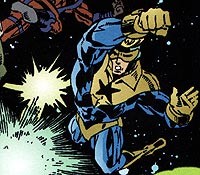
See anything funny about that panel? Booster looks like he's wearing swim briefs!
It's common for characters appearing in one-shot issues to look a little off-model. After all, the artists on these things wouldn't always be familiar with the characters they were drawing.
Prior to this panel, Darryl Banks had only drawn Booster as part of the large crowd attending the funeral of Green Lantern Hal Jordan. In that issue, Booster wore his Mark X armored power-suit.
We'll give Banks a pass for this snafu. Besides, the inker he was working with certainly had no idea what he was doing. It was the first time he'd ever worked on Booster Gold for DC Comics. His name was Norm Rapmund. I wonder whatever happened to that guy?
Comments (0) | Add a Comment | Tags: costumes darryl banks justice league norm rapmund
Tuesday, May 27, 2014
That Really Isn't an Improvement
DC released the Dan Jurgens/Norm Rapmund cover art for Booster Gold: Futures End #1 late last week. And it..., well, see for yourself:
I'm a big fan of Jurgens' art, but I have to say that this isn't his best work. Was this piece rushed? The foreshortening on Booster's forearms in the "before" panel is especially unpleasant. (Look at the "stripes" on the biceps and forearms and try to imagine what they would look like if Booster was holding his arms out straight.) I understand that the 3D covers are created from layers, and maybe they arms will look better in the finished 3D piece. However, they just don't come together well here.
What I hate about that second panel isn't Jurgens' fault. (Although note that Booster's hair is parted on the opposite side. Was that intentional?) That A.R.G.U.S. armor is really not awesome. As has been mentioned before, it looks a lot like Booster's mid-1990s power suits. Those bulky costumes were supposed to look awkward and awful as part of their stories. Is that the case here? I hope that someone at DC hasn't become nostalgic for those old stinkers.
Russ Burlingame scoured these images for what they might tell us about what we'll see between the covers this September. You can read his analysis at ComicBook.com.
Comments (4) | Add a Comment | Tags: comicbook.com costumes covers dan jurgens futures end norm rapmund russ burlingame
Monday, May 19, 2014
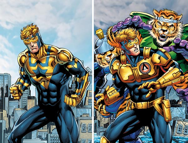
They're Putting the Band Back Together
Friday, DC released the art teams for September's Futures End month of one-shots. Booster Gold: Futures End #1 will be looking pretty good.
BOOSTER GOLD: FUTURES END #1
Writer: Dan Jurgens
Artist: Moritat, Steve Lightle, Stephen Thompson, Mark Irwin, Ron Frenz, Brett Booth, Will Conrad
Cover: Dan Jurgens, Norm Rapmund
That's right, Dan Jurgens and Norm Rapmund are back together on the lenticular cover. DC has already started rolling out previews of the covers for the first two weeks of the event, so we should be seeing the week 4 Booster Gold cover sooner rather than later. September can't get here soon enough!
You can find a full list of creative teams for the Futures End one-shots at dccomics.com.
Comments (3) | Add a Comment | Tags: dan jurgens futures end norm rapmund
SITE SEARCH

SPOILER WARNING: The content at Boosterrific.com may contain story spoilers for DC Comics publications.
Booster Gold, Skeets, and all related titles, characters, images, slogans, logos are trademark ™ and copyright © DC Comics unless otherwise noted and are used without expressed permission. This site is a reference to published information and is intended as a tribute to the artists and storytellers employed by DC Comics, both past and present. (We love you, DC.) Contents of this page and all text herein not reserved as intellectual property of DC Comics is copyright © 2007-2024 BOOSTERRIFIC.com. This page, analysis, commentary, and accompanying statistical data is designed for the private use of individuals and may not be duplicated or reproduced for profit without consent.