

Showing posts 71 - 74 of 74 matching: reboot
Thursday, July 7, 2011
Dan Jurgens at The Source
[EDIT 4:09 PM EDT: Sorry, sorry. I worked a 12 hour day yesterday, started early this morning, and in between I just plain forgot to upload today's blog post. Please forgive me.]
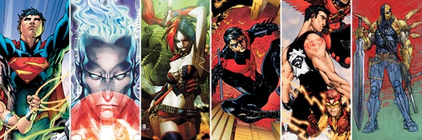
Erin beat me to this news over in the forums, but Dan Jurgens took his turn in the DC reboot hype machine yesterday at The Source. Jurgens will be drawing Green Arrow and writing Justice League International, both titles that Jurgens has worked on in the past.
How and why are you shaking up the series' status quo?
In GREEN ARROW, we're getting back to the basics of what makes Oliver Queen work. He's accumulated a lot of baggage over the years and it's time for some of that to go.
In JUSTICE LEAGUE INTERNATIONAL, we're really dealing with an entirely new DC Universe. For Booster, Guy Gardner, Rocket Red and the rest this is a new adventure...
Will we see new character designs?
Green Arrow will absolutely have a new look, though he'll still be wearing green— naturally!
In JLI, several of the characters have cool, new looks!
This interview form-letter has been repeated over and over again at The Source for the new DC titles, and the questions say more about DC's approach to this mess than any of the artists have about their individual books. How do you have a "status quo" to "shake up" if you are starting from scratch in a new universe of stories? Why ask why the titles are being shaken up when the company mandated a number one relaunch for all series? Why ask about new character designs when the company has already widely promoted Jim Lee's redesigns? DC, I just don't understand you sometimes.
The full interview (and many other similar interviews) are available on DC's The Source blog here. If you have something to say about this interview or either of these two series (I won't insult you by asking which one you are most excited about -- it's the one with Booster in it, of course), consider dropping in on Erin's thread in the Boosterrific Forum here.
Comments (2) | Add a Comment | Tags: dan jurgens dcu.blog.dccomics.com reboot
Friday, June 10, 2011
DC Stands for Dumb Committees
Last Friday, I made a fuss over Booster Gold's new costume. After careful contemplation of what I wrote, I stand by my original assessment.
THIS COSTUME STILL SUCKS.
However, I laid all of the blame for the vomit-inducing misguided costume redesign on DC Co-Publisher Jim Lee, largely because that's who DC blamed it on in their original announcements. However, yesterday Lee announced that he would not be taking the fall alone. On DC's The Source blog, Lee wrote:
Months ago, when the decision was made to launch 52 new number ones, Co-Publisher Dan Didio, Editor-in-Chief Bob Harras along with DCU Executive Editor Eddie Berganza and VP-Art Direction and Design Mark Chiarello and I went over the entire proposed DCU lineup and bookmarked the characters we felt would benefit the most from a visual redesign.
... Realizing the amount of time and effort it would take to complete the long list of designs, Mark Chiarello and I enlisted artist Cully Hamner onto the team, giving us not just another set of hands but another style altogether so we would have a variety of styles to literally draw from.
... And of course, all the designs were shaped and refined by the input of a series editor, writer and artist. In the end, we wanted to make sure all the key creators on a title were satisfied with the final look of the characters as the creative teams were the ones who had to live with and draw the new looks on a near daily basis.
So now that we've gotten an eyeful of the worst costume designs since the 1990s, Lee is being sure to drag everyone else down with him give "credit" to all the other artists involved. What a great guy.
Does this mean that Dan Jurgens, a "key creator" for the upcoming Justice League International title, was a significant part of the team that designed that Booster Gold costume? Being pretty familiar with Jurgens' artistic history, I somehow doubt it. Would Jurgens' involvement in the creation of that costume make me hate it less? I somehow doubt that, too. This would be at least the third Booster Gold powersuit that Jurgens had a direct hand in designing, and it is by far the worst.
Not every costume in this entire shake-up is bad. The problem is that most of them are. And they are all coming at the same time, so rather than being given time to acclimate to the horrific appearance of, say, a Jersey Shore-Superboy or an anime-Deasthstroke, we readers are forced into making a snap decision: do we want to pay to look at these abominations Hot Topic-inspired fashions or not?
Jim Lee, I don't care whose fault it is, I just don't want to look at the comic books you are publishing anymore.
Comments (4) | Add a Comment | Tags: costumes dan jurgens dcu.blog.dccomics.com jim lee reboot
Tuesday, June 7, 2011
Dan Jurgens Hints at JLI
In general, Dan Jurgens is tight-lipped in interviews. He rarely if ever gives away any secrets about his upcoming stories. That's great if you want to avoid spoilers, but frustrating as the firmament of the DC Universe appears to be reshaping itself beneath our feet. In the past few days, Jurgens has given interviews to both Comic Related and Newsarama that may contain clues to the future of Booster Gold.
From "Dan Jurgens on life after Flashpoint " by Russ Burlingame at Comic Related:
CR: This is probably a conversation for another time, but Booster Gold has been the protector of the timeline. What happens here, a massive shift in history and continuity and all that, seems to suggest that he fails rather spectacularly. Was mitigating that impression part of why Booster was allowed to be "the guy who gets to see Flashpoint"?
DJ: I don't think this change suggests that at all. With a lot of this, you have to wait until you read the end of the story.
CR: Of all the characters in the JLI, it appears as though Booster Gold is the character who got the most radical redesign of his costume. That seems to dash the theories that a lot of us had about his being the "Psycho Pirate" of the new universe--the one guy who remembers the way it used to be. Will we get a real, solid ending for Booster, Rip and company since their role in Flashpoint lends it to one more than any other title?
DJ: I'll be happy to answer questions about the end of Booster Gold and Flashpoint... once it appears in print. No writer gives away his ending!
Bad news first: Jurgens appears to be confirming the cancellation of Booster Gold Volume 2. However, Jurgens is a crafty interviewee, so we can only take his responses at face value. It's always best not to read too far into his responses. (Keep hope alive!)
From "Jurgens Brings International Flavor to DCnU in Revamped JLI" by Vaneta Rogers at Newsarma:
Newsarama: Dan, what attracted you to writing the Justice League International?
Dan Jurgens: It's the Justice League! International style, yes, but it is still a vehicle for some of DC's best heroes, which as part of this new launch, is tremendously appealing.
I've always been drawn to books that allow for a wide range of stories that have a chance to be big in scope, and the JLI certainly fits that description. Plus, it's a chance to continue to lift Booster Gold's profile, which we've been working on the past few years.
Nrama: Is this the whole team?
Jurgens: This is the whole team for this issue! After that... things can change.
The good news is that Jurgens is committed to raising the profile of Booster Gold. This means there will be plenty of Booster in the upcoming Justice League International series. Better still, if things are really so flexible in the future, maybe Booster won't be stuck with that terrible costume for too long!
Comments (2) | Add a Comment | Tags: comicrelated.com dan jurgens newsarama.com reboot russ burlingame vaneta rogers
Friday, June 3, 2011
DC Stands for Dumb Costumes
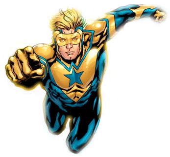
I had almost gotten used to the steady stream of terrible news coming out of DC Comics this week. Every book is getting cancelled so that titles can restart at number 1? Stupid, but I survived the 1990s once. DC will be launching 52 titles over the course of a month? Ridiculous, but I survived the DC Explosion, too. Creative teams are being totally reshuffled? Pointless, as the best teams will still be on the books with the highest selling potential. Every DC character dons a new costume designed by Jim Lee. Uh oh.
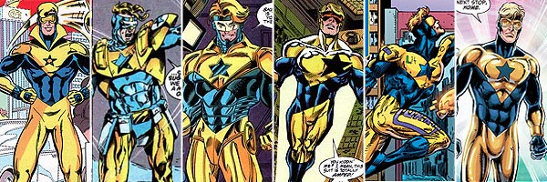
There's no denying it: Booster's first costume was a time-capsule of its era. Love it or hate it, it screams 1980s, as did the character of Booster Gold: a selfish corporate crusader who saw super-heroics as a means to capital wealth. For good or ill, the high-collared costume became indelibly associated with the character.
By the 1990s, both Booster's status and costume were destroyed. His costume was redesigned to look completely ridiculous, like a football player's pads on steroids. This was done intentionally, allowing a slow transition during which his costume design could evolve alongside its wearer, eventually emerging with typically 1990s flair. These costumes weren't all good -- that was the point -- but the changes were story-driven and organic.
Booster was reunited with his partner Blue Beetle in the 2000s, and his costume was miraculously and inexplicably restored to its 1980s glory. Take note, if you are going to make changes to a design without explaining how or why, tried-and-true is the direction to go. Someone must have realized that this costume wasn't new-millennium enough, and the collar was dropped and the gold sections of costume were linked by wide stripes. Sponsorship patches were added and removed, all in the name of character development.
But now DC decides to change everything just for the sake of changing everything. This is a marketing event, plain and simple. Somewhere someone said, "Jim Lee's art sells, so let's let Jim Lee do all our art!" Make no mistake about what this really is: a travesty.
THIS COSTUME SUCKS.
While Booster's costume was once iconic and unique, it now looks like every other "future-tech" costume in comics. Yes, Booster has a blue star on a gold field. And he's wearing goggles with exposed blonde hair. It's almost like there was a corporate-mandated checklist for what Booster's costume had to incorporate for licensing purposes. (You don't really want the kids who see Booster Gold on Batman: The Brave and the Bold, DC Universe Online, and Smallville to wonder who this dumb-looking character is, do you, DC?) After that, it goes quickly to hell. From the top down:
- Head: Booster Gold now has a visible forehead. This means that either his goggles are responsible for holding his cowl up, or he has a very stiff and uncomfortable head covering. On the upside, artists now have space to draw sweat on Booster's brow! Hoo-ray?
- Face: What is the need for the gold on the mask around the face? Is Lee just curious to see how fast he can make the colorist screw it up? The design makes Booster look older and wider. Apparently now "Booster Gold" should be synonymous with "fat head."
- Neck: Why a "w" encircling the neck? This is artist shorthand for "technology" and does nothing but make the neckline busier. As if we didn't already know it, Jim Lee demonstrates his belief that you can never have too many extra lines on a costume.
- Shoulders: Yay! More extraneous piping on the shoulders. At least Booster doesn't have full-scale 1990s shoulder-pads, but I'm guessing that's only because someone realized that would be too obvious.
- Arms: I suppose it was too unrealistic to have his Booster Shots mounted on the back of his gloves anymore, so now Booster has sleeves. What kind of high-tech design is that in gold at the end of the sleeve, anyway? Atlantean? Apokolipsian? Arrows? Please, not arrows. Surely by now Booster Gold knows which end of his arms to point at the bad guys without context clues on his costume.
- Waist: There is no such thing as a great male super-hero costume without a belt or similar costume element separating the torso from the waist. Otherwise the costume ends up looking like a unitard, and no one looks great in a unitard.
- Feet: We can't see them here, but I promise you they look terrible. The new costume probably doesn't even have golden boots, but terminates in solid blue stocking feet in keeping with previous costumes. Couple that with the lack of a belt, and Booster's new costume would look like elaborate footed pajamas.
Will this redesign stick around? I sure hope not. It already looks like garbage. The sooner DC takes out this trash, the better.
Comments (14) | Add a Comment | Tags: costumes dccomics.com jim lee reboot
SITE SEARCH

SPOILER WARNING: The content at Boosterrific.com may contain story spoilers for DC Comics publications.
Booster Gold, Skeets, and all related titles, characters, images, slogans, logos are trademark ™ and copyright © DC Comics unless otherwise noted and are used without expressed permission. This site is a reference to published information and is intended as a tribute to the artists and storytellers employed by DC Comics, both past and present. (We love you, DC.) Contents of this page and all text herein not reserved as intellectual property of DC Comics is copyright © 2007-2026 BOOSTERRIFIC.com. This page, analysis, commentary, and accompanying statistical data is designed for the private use of individuals and may not be duplicated or reproduced for profit without consent.